Manicure Mania, Pt. IV: French Tip, Blown to Bits
 The reality of DIY nail art is that sometimes... sometimes... things don't work out. I've attempted works of art that seemed like a genius idea in theory — only to find that, in practice, good ideas don't always equal great nails.
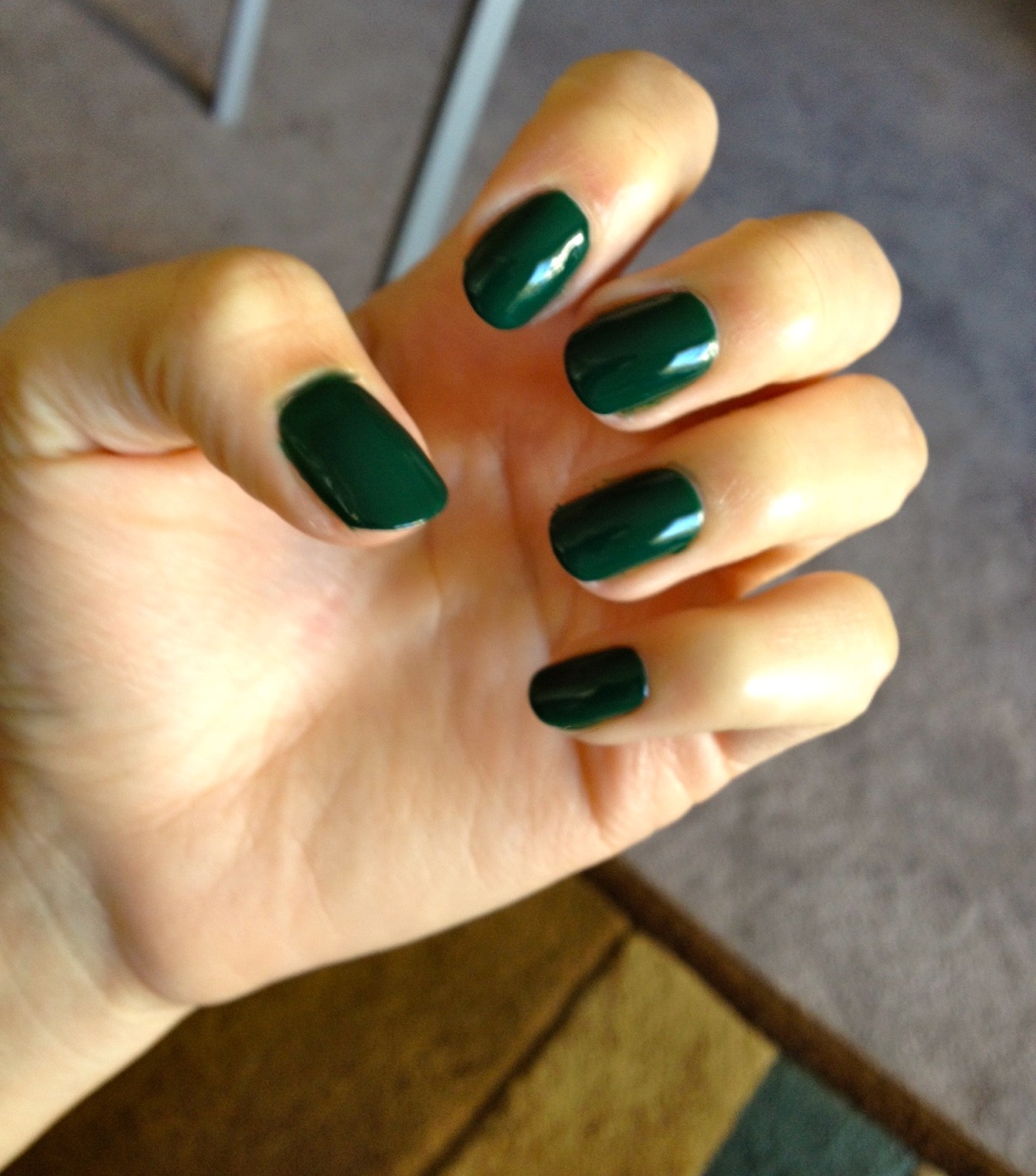
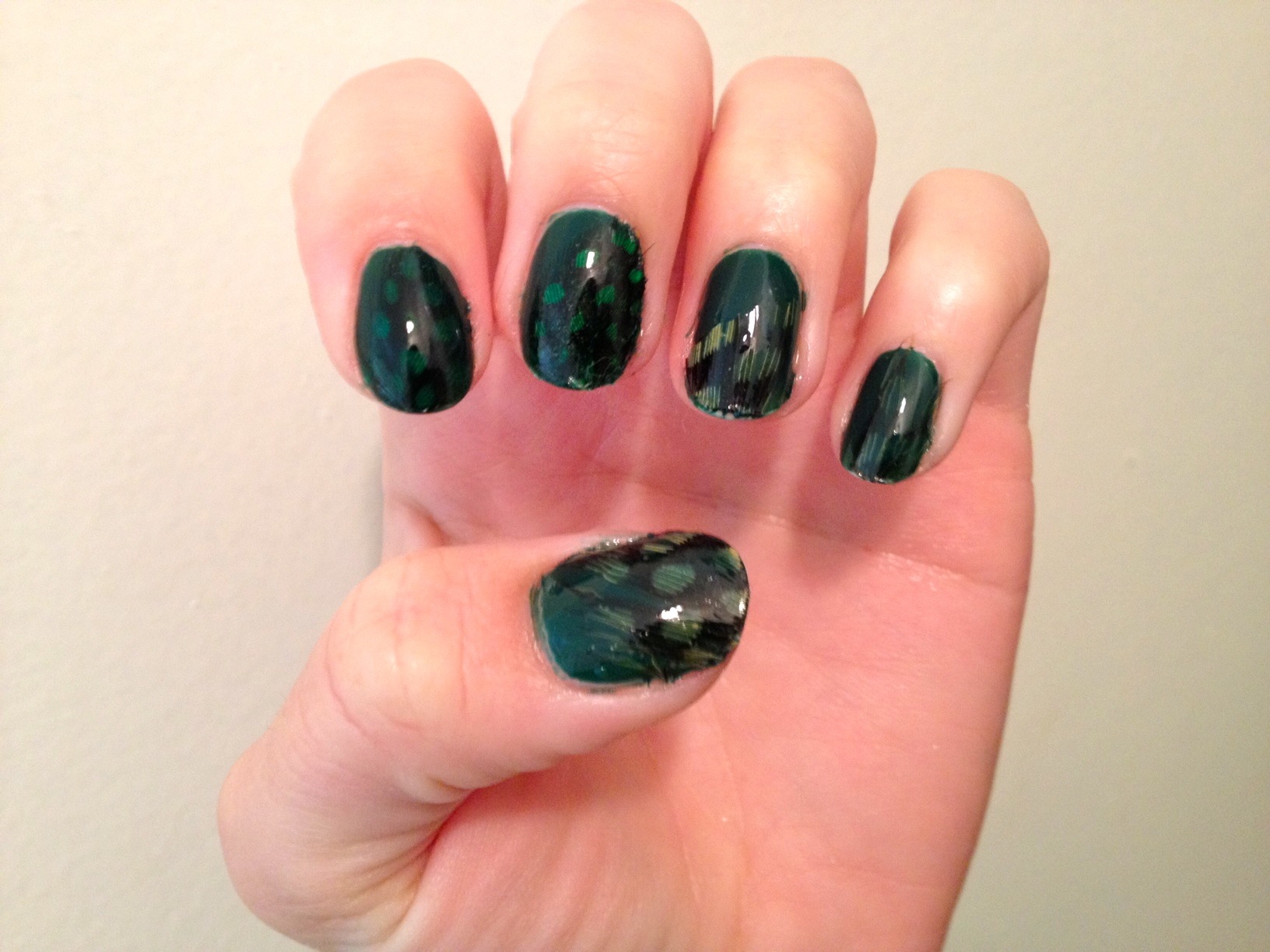
For example, I thought this gorgeous Illamasqua nail polish that my friend Alison gave me, Kink, would look awesome with feathers on it.
Feather FAIL.
When I heard that MAC was offering new & improved, on-trend press-on nails (!) I raced to my compy to see what they'd dreamed up. And I saw this:
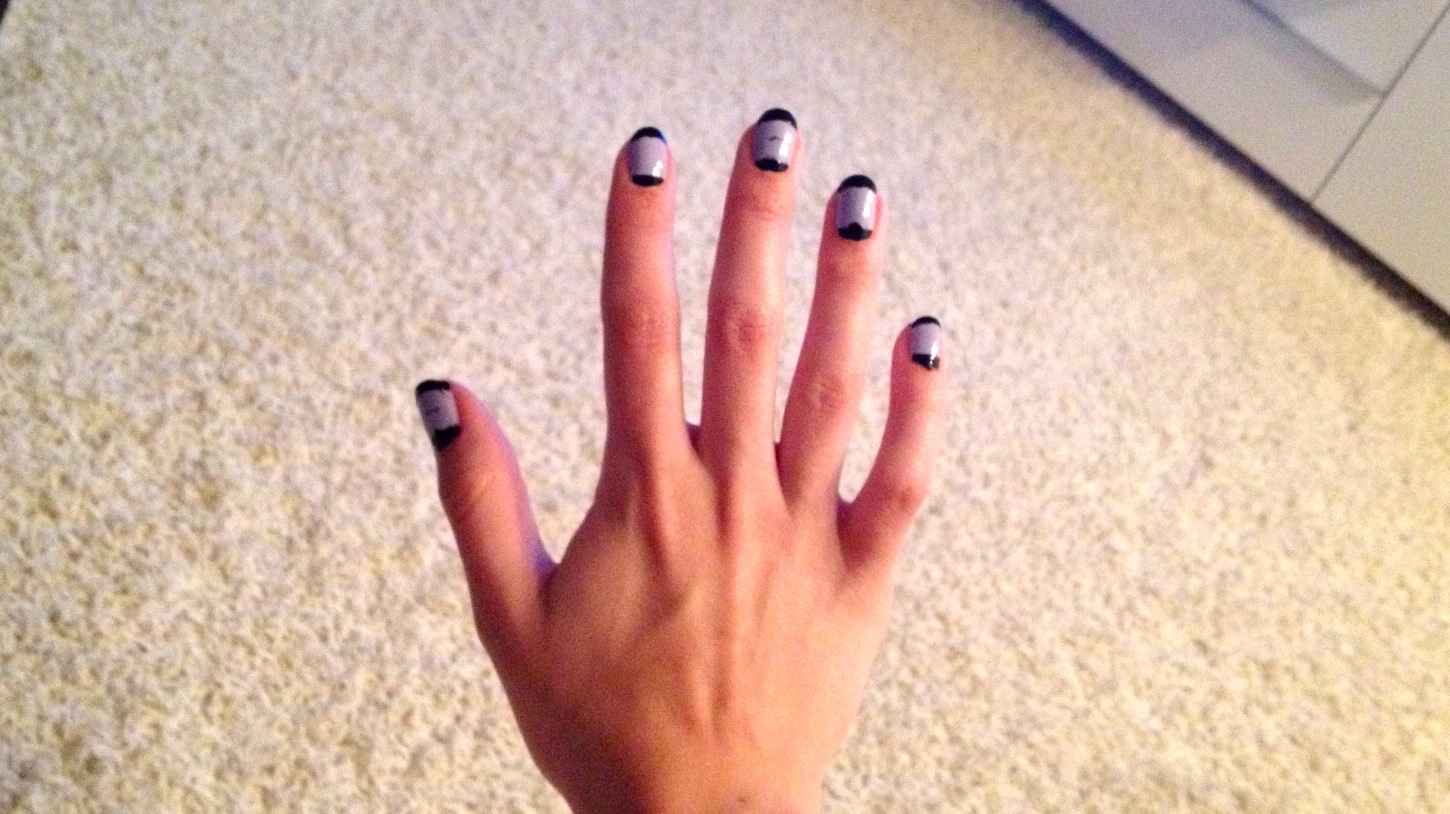
What beauty! I loved it! So crisp and clean! I thought a pale lavender would suit my wardrobe better, so I grabbed Revlon's Lily and my ol' faithful, Sally Hansen Black Heart, then I set to work.
First, two coats of Revlon Lily. Next, I used french tip tape and gave myself black tips. Easy enough. Then I used ring enforcers to create a black half moon at the cuticle. And here's where I went wrong. Partly an issue of impatience, and partly due to the fact that I was really sick with a sinus infection and in a stage of delirium, the half moons were a mess.
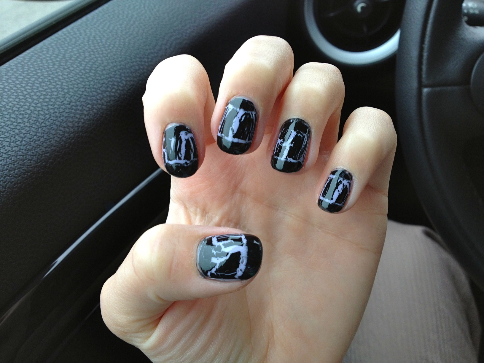
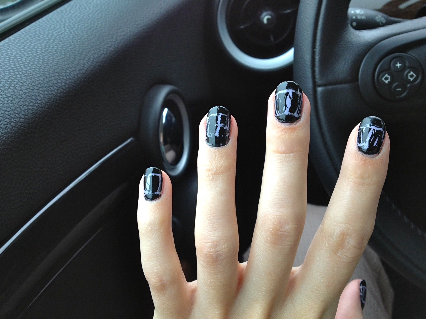
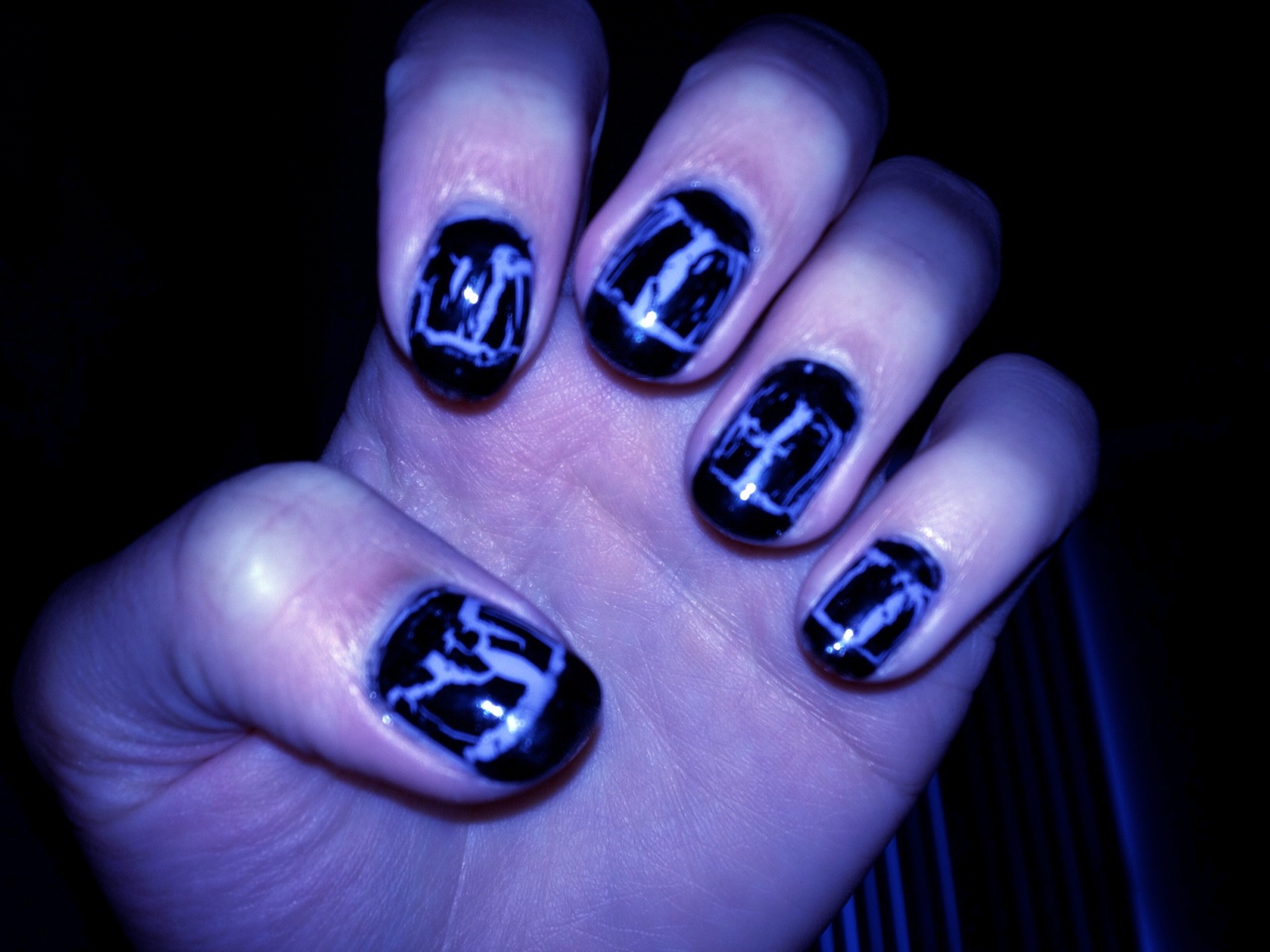
I felt too ill to start again and, so help me GAH, I was not going to let my nails go naked. There was only one product I could turn to; only one polish that could cover oh, so many sins: SHATTER.
My favorite crackle polish is by OPI, who calls it "shatter." If you apply a thin coat, you get tiny little cracks. Apply a thick coat for great, big dramatic fissures.
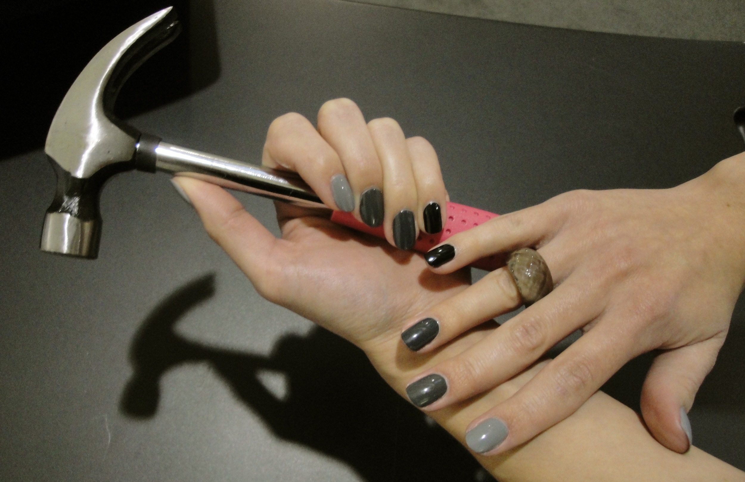
I thought this mani was dead for sure but, like a phoenix, it rose triumphantly from the ashes of carelessness to emerge as the shiny, eye-catching mani I knew it could be.
shattercracklepop, Francesca

